Samakshetra
A comprehensive brand identity development for a wellness spa, establishing a cohesive visual language through thoughtful logo design, curated color palette, and strategic promotional materials.

Samakshetra, an exceptional wellness destination, served as the canvas for this brand identity exploration. At the heart of the design lies a carefully crafted logo centered around the spiral—a fundamental pattern found throughout nature, the cosmos, and human DNA itself. This elegant spiral symbolizes growth, self-awareness, and transformation, perfectly embodying the spa's wellness philosophy.
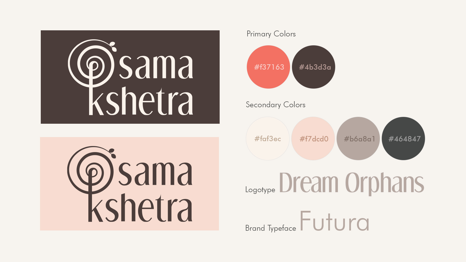
The distinctive color palette features salmon pink and crater brown as primary tones—a deliberate choice that distinguishes Samakshetra within the competitive wellness landscape. These hues evoke sensations of warmth, comfort, stability, and reliability, visually reinforcing the brand's commitment to its clientele.
The cohesive identity system extends seamlessly across various branded products, creating a harmonious and recognizable presence that resonates with the spa's holistic approach to wellness.